The colours of 2026 are dug out of the ground, not picked off a chart
Terracotta, olive, mustard, indigo and a brown that behaves like black. The pigments arriving in Indian homes this year, and how to use them so the room still looks right when the chart changes.
- Written by
- The Élara Studio
- Published
- Reading time
- 5 min read
Every paint company announces a colour of the year, and every year it is a colour nobody has on their walls twelve months later. The shift happening in Indian homes in 2026 is bigger and slower than that, and it did not start in a marketing department.
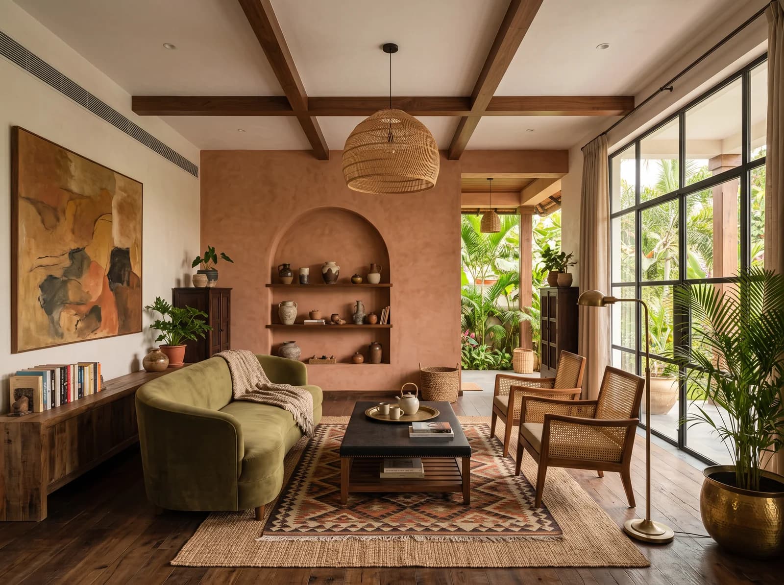
It started with people getting tired of grey. What has replaced it is a palette that comes from clay, leaf, spice and timber: terracotta, olive, ochre and mustard, indigo, and a whole family of browns from coconut to espresso. These are the colours India has always painted with. They are simply back in the rooms that had been trying to look like Scandinavia for a decade.
The five pigments of the year
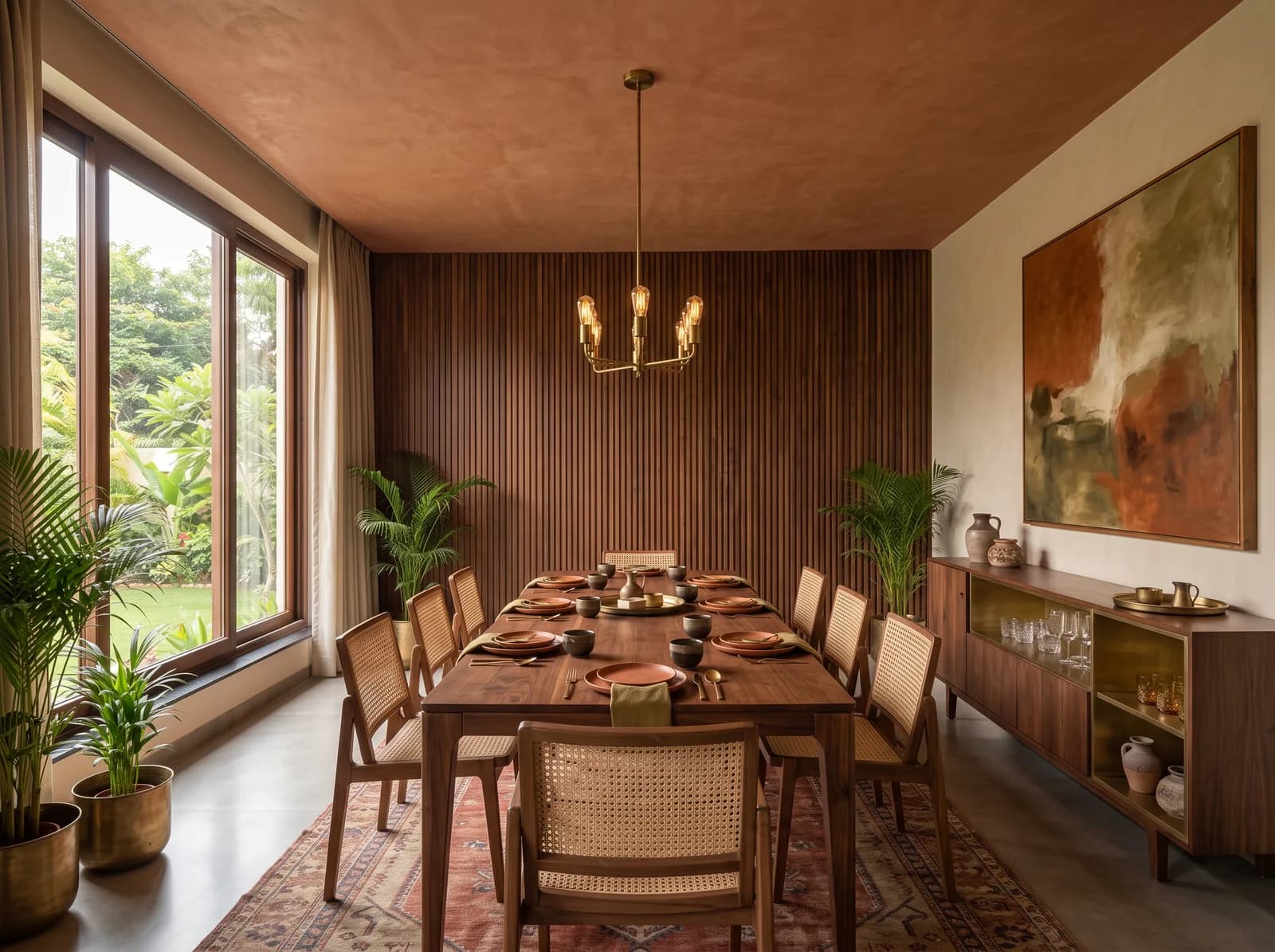

Terracotta
Not the orange of a flowerpot but the burnt, dusty red of a Chettinad wall or a Rajasthani fort at dusk. In plaster rather than paint it is extraordinary: the pigment sits inside the surface and the wall glows rather than shouts. It wants walnut and brass beside it, cane and jute underneath, and very little else. The Olive Frame Villa's dining room takes it onto the ceiling, where it makes the evening meal feel like it is happening inside a lantern.
Terracotta plaster on the ceiling, walnut on the wall, cane at the table. Studio visualisation.
Olive
The studio's own colour, and the one that appears most in this year's briefs. Olive is the green that behaves like a neutral: it sits happily next to oak, limestone, brass and terracotta, and it looks as right in a kitchen as on a velvet sofa. It is the colour we reach for when a room needs one deep note and the family is nervous of colour. Nobody has ever regretted an olive kitchen.
Ochre and mustard
The colour of turmeric and of a marigold garland, which is to say the colour of every Indian celebration. It is too strong for a wall in a daylit room and perfect in the ten percent: a single armchair, a throw, the inside of an arched niche, the back of a bookshelf. Used that way it makes a quiet room look lit from within.
Indigo and ink
The cool member of the family, and the one that lets everything else breathe. Indigo in a block-printed linen, an inky blue-black on the joinery of a study or a bar, a deep navy in the powder room. Where the greys of the last decade drained a room, indigo anchors it, because it has depth where grey has only tone.
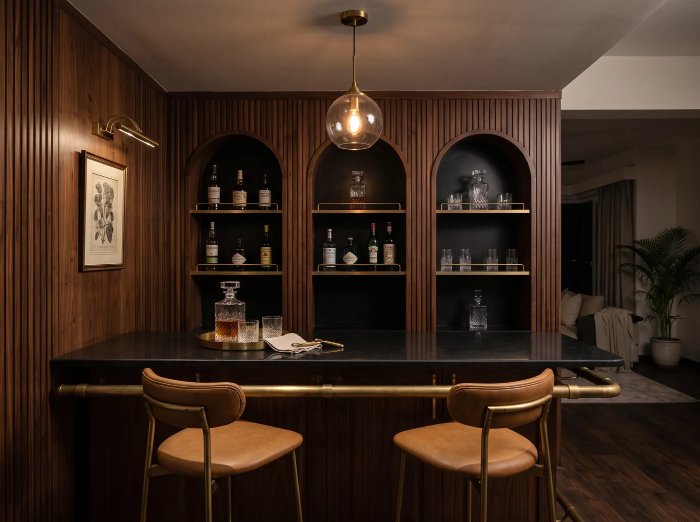
Brown, doing the job black used to do
The most quietly important shift of 2026. Where a room once asked for black, it now asks for espresso, chocolate, dark walnut. Brown has the depth of black without the hardness, and it warms every colour placed beside it. A dark walnut bar with amber glass and tan leather is richer than the same nook in black and chrome, and it will still look right when black and chrome come back around.
The Amber Bar Nook from the boutique: dark walnut, amber, tan leather and brass, no black anywhere. Studio visualisation.
How to use them without redoing the room in 2028
The ratio we use in every room applies to colour more than to anything else. Seventy percent of the room is the quiet field, in warm whites or the palest version of the palette above. Twenty percent is the support: the timber, the textiles, the mid-tones. Ten percent is the voice, one pigment from the list above, spoken once and echoed twice. A room that follows the ratio can change its voice in an afternoon with a new throw and a repainted niche. A room drenched in the voice cannot.
- 70%
- Warm whites and the palest tones: walls, floor, large pieces
- 20%
- Timber, textiles, drapery in the mid-tones
- 10%
- One pigment of the year, spoken once
The ratio from the quiet luxury note, applied to colour. The ten percent is where 2026 lives.
Where to drench, and where to hold back
Colour drenching, one pigment on walls, ceiling, trim and joinery together, is the most requested idea of the year and the most misused. It is wonderful in a room that wants to be a cocoon and exhausting in a room that wants to be light. Our rule of thumb for a Bengaluru home:
- Drench: the media den, the study, the powder room, the bar, a guest bedroom that is used after dark. Espresso, olive, indigo, terracotta.
- Hold back: the living room, the kitchen, the primary bedroom, anywhere the morning light matters. Keep these in the field and let the colour arrive in the ten percent.
- Never: a north-facing room in a deep colour with a single window. It will be a cave for nine months of the year.
The material matters more than the shade
A terracotta wall in emulsion and a terracotta wall in lime plaster are two different colours, even from the same chart. Paint puts the pigment on the surface; plaster puts it inside, where light can move through it. The same is true of olive in velvet against olive in laminate, and of indigo in a hand-blocked linen against indigo in a printed polyester. If the budget allows one upgrade, spend it on the material the colour lives in, not on a more expensive shade.
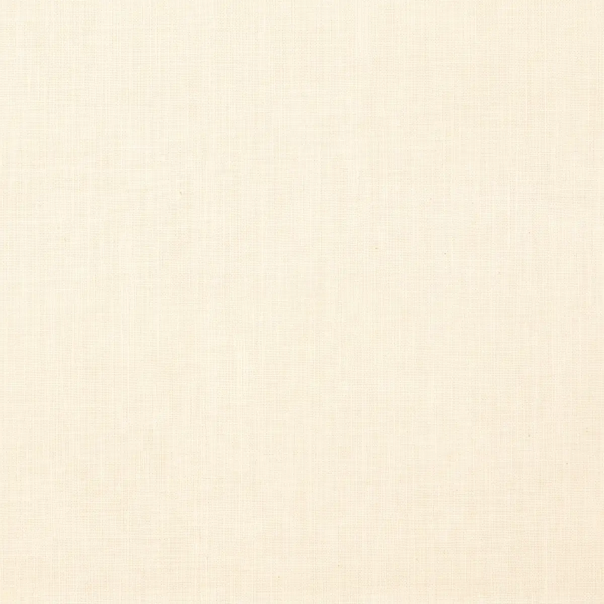
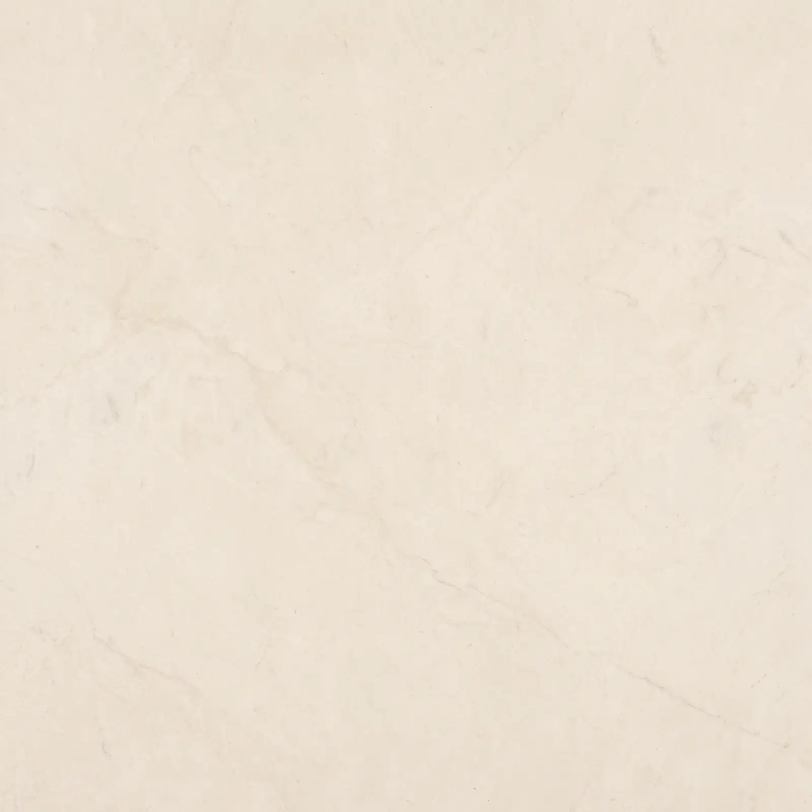
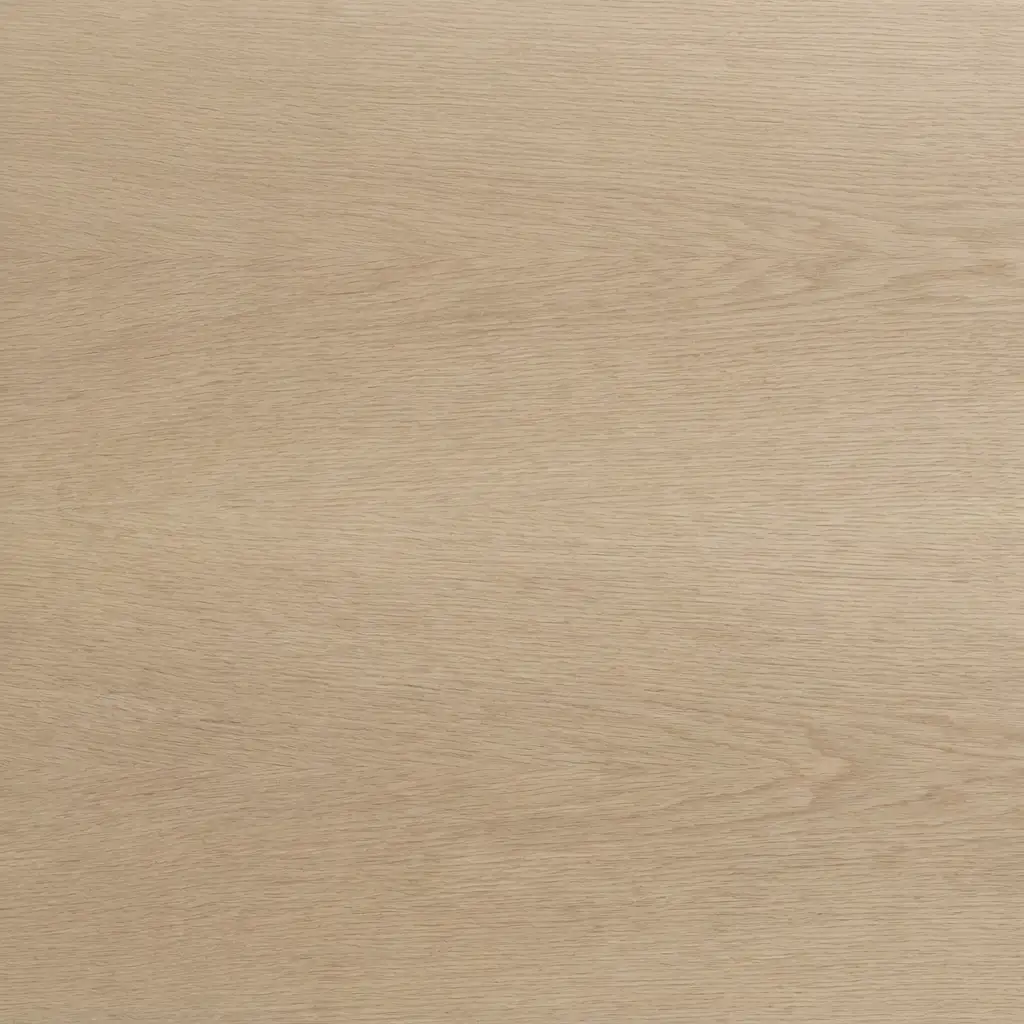
A palette for a Bengaluru 3BHK, as we would draw it
| Room | The field | The support | The voice |
|---|---|---|---|
| Living | Chalk lime plaster | Pale oak, oatmeal linen | Olive, in one sofa |
| Kitchen | Warm white PU | Leathered granite, brass | Olive framed cabinets |
| Primary bedroom | String plaster | Oak headboard, washed linen | Terracotta throw |
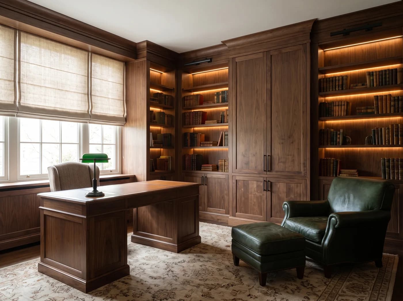
| Study | Drenched: forest or espresso | Walnut, tan leather | A brass lamp |
| Powder room | Drenched: indigo | Honed stone basin | Unlacquered brass |
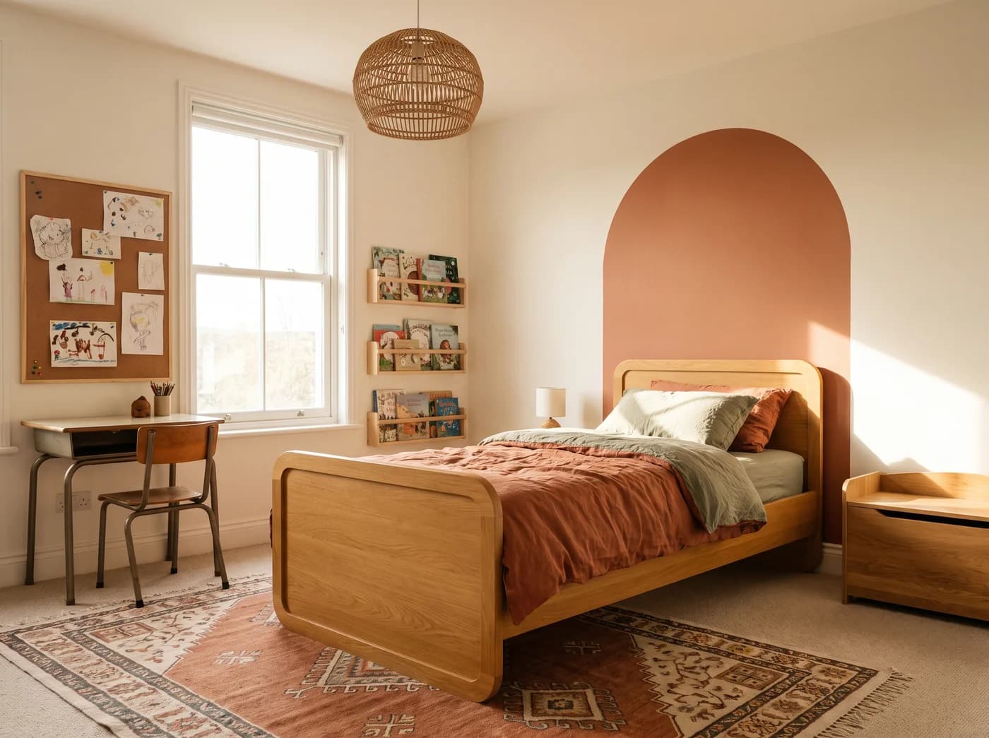
| Kids' room | Warm white | Pale oak, cane | Terracotta and sage arch |
One home, five pigments, and no room that will need repainting when the chart changes.
The colours of 2026 are old friends of Indian homes, which is the best thing about them: they were never fashionable, so they cannot go out of fashion. If you would like to see them in your own rooms rather than on a chart, send us a floor plan. Within seven days you will have your main rooms designed photorealistically in the palette that suits your light, with a board on its way to your door.
Questions we get asked
- What are the interior colour trends for 2026 in India?
- Deep naturals have replaced grey and pastel: terracotta, olive, ochre and mustard, indigo, and rich browns from coconut to espresso. They are used as one deep note in a room of warm whites, or drenched across a single cocoon room such as a study or a media den.
- What is colour drenching and does it work in Indian homes?
- Painting walls, ceiling, trim and joinery in one deep pigment so the room becomes a single tone. It works in rooms used after dark, such as a study, media den, bar or powder room. In daylit living rooms and bedrooms it tires quickly; keep those in warm whites and let colour arrive in textiles and one piece of furniture.
- Which colours go with olive green interiors?
- Olive sits naturally beside pale oak, limestone, aged brass, terracotta and warm whites. It behaves like a neutral, so it works as a kitchen cabinet colour, on a velvet sofa, or as the one deep note in an otherwise quiet room.
Photographs on the Journal are the studio's own visualisations of rooms as designed, captioned as such. Figures are indicative Bengaluru bands, dated in each post, never a quotation.