Quiet luxury is a material decision, not a colour
Beige alone is a waiting room. The calm rooms people send us are built from five materials, kept in one ratio, and lit for shadow.
- Written by
- The Élara Studio
- Published
- Reading time
- 4 min read
The phrase arrives in a brief most weeks now, usually with a photograph of a beige room attached. The photograph is almost always good. The room in it is almost never beige.
It only reads that way because the contrast has been kept low, and what is actually doing the work is grain, weave, veining and patina, layered until the eye has somewhere to rest and something to find. So, to the materials. Quiet luxury is not a paint chart. It is five decisions about what a room is made of, one ratio, and the discipline to stop.
The five materials doing the work

Lime plaster
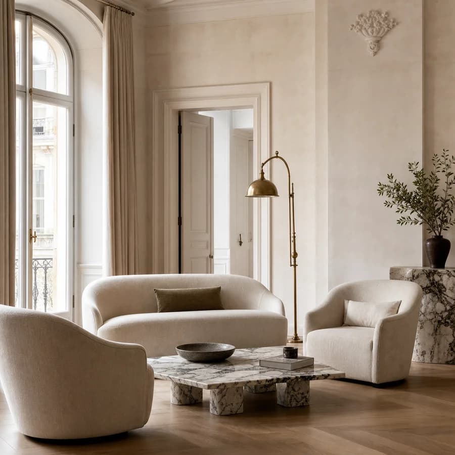
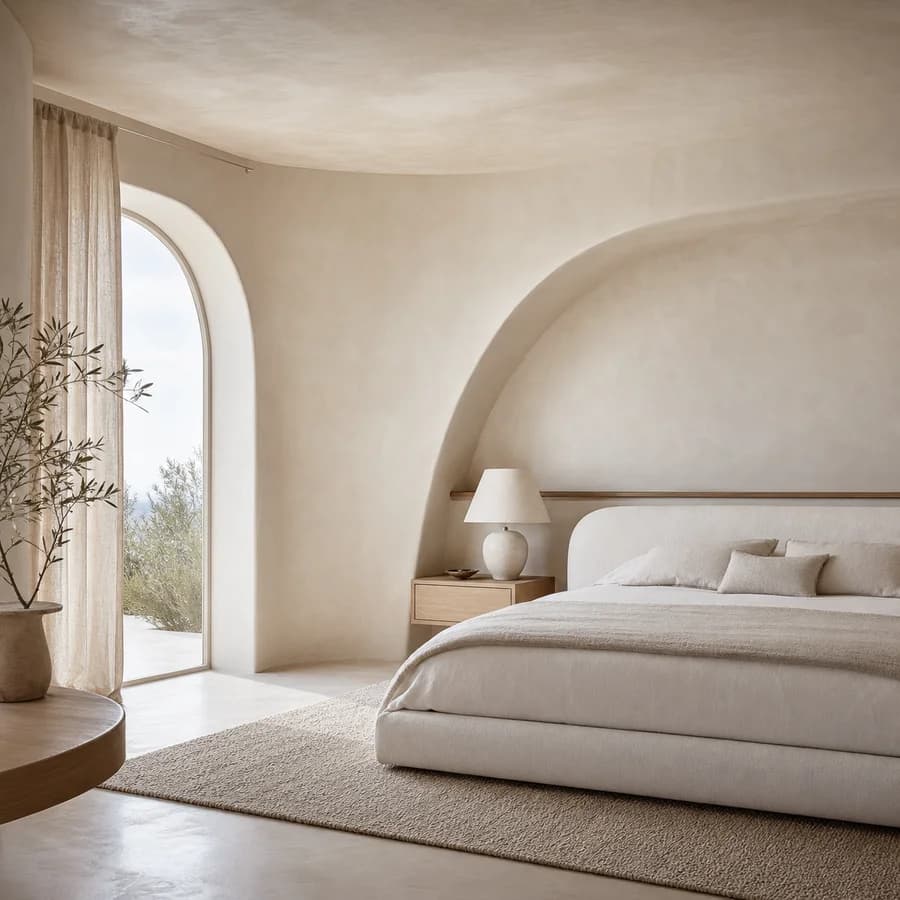
The wall you cannot quite describe is usually lime. Unlike paint, it holds light in its surface rather than on it, so a wall changes across the day without ever being a colour. It breathes, which matters in Bengaluru's humid months, and it takes a mark with grace rather than a scuff. We use it in the rooms where people sit still: living rooms, primary bedrooms, the foyer.
Plaster, an arch and linen: the whole Quiet European vocabulary in one frame. Studio visualisation.
Rift-cut and fumed oak
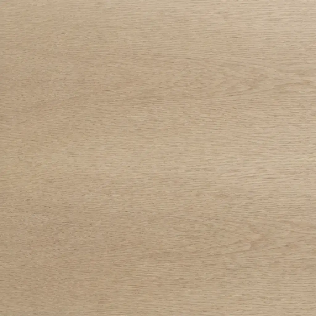
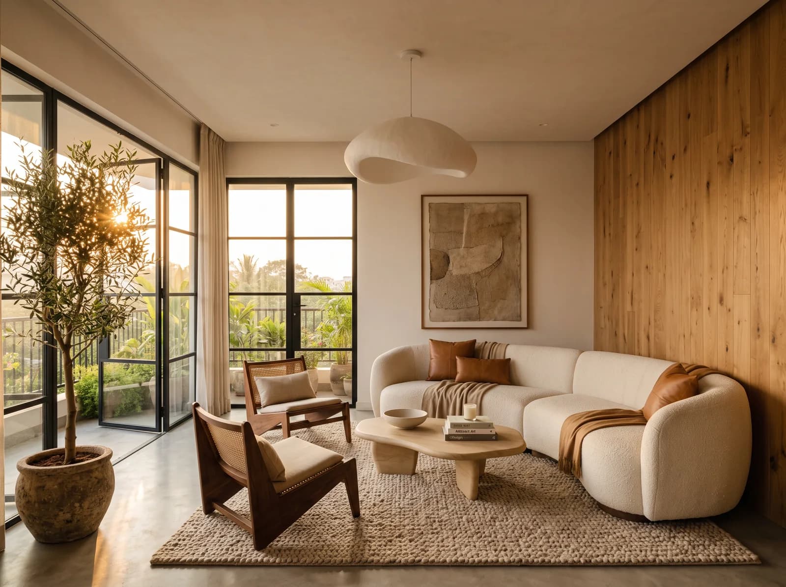
Oak, cut so the grain runs straight rather than in cathedral arches, is the quietest wood there is. Fumed, it goes to a deep honeyed brown without a stain. On a fluted media wall or a slatted headboard it gives a room its rhythm, and it is the material clients touch first when they walk into a finished home.
Honed stone
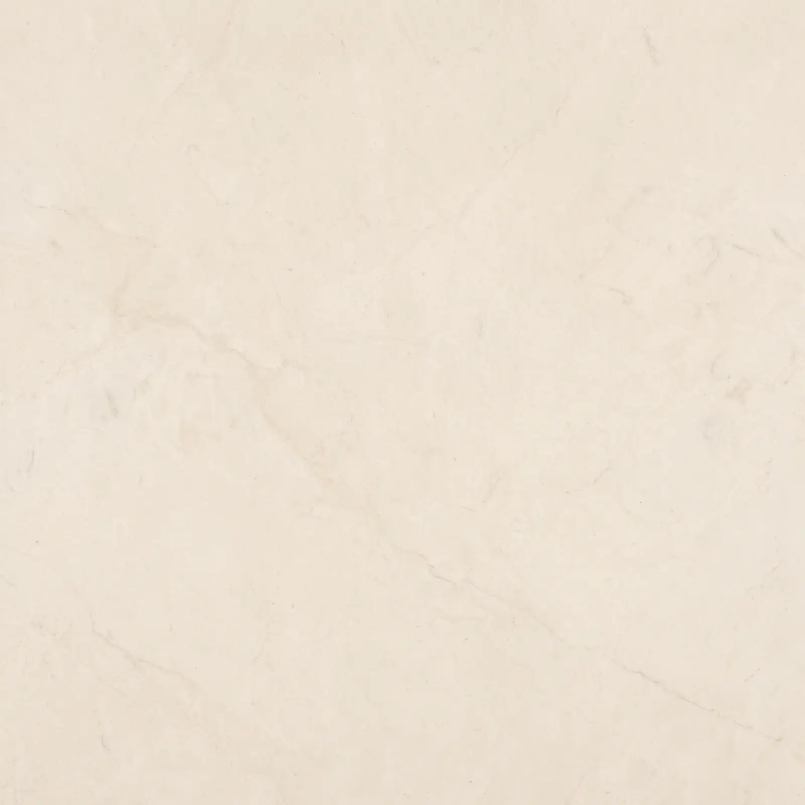
Polished marble reflects; honed limestone and travertine absorb. On a floor, a ledge behind the bed or a kitchen island, a honed stone is the difference between a room that glitters and one that settles. It is also more forgiving of a dropped key.
Linen, wool and bouclé
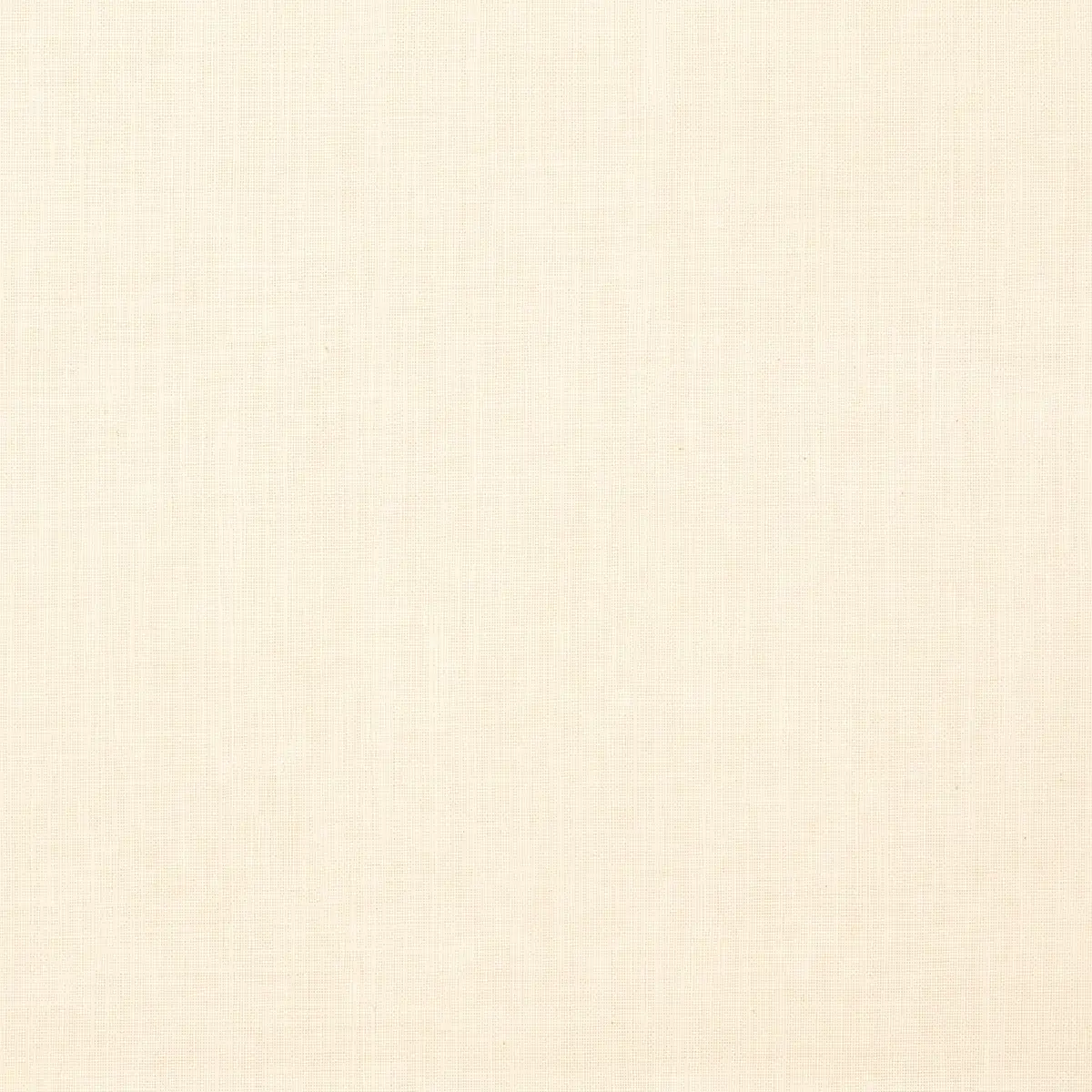
The soft layer is where most rooms fail, because it is bought last and cheapest. Washed linen on the bed and at the windows, a wool rug underfoot, bouclé on the one curved piece the room is allowed. Three textiles, none of them shiny, and the room stops looking staged.
Unlacquered brass
Chrome stays new. Brass keeps time. Left unlacquered, it darkens where a hand lands, and by year five the pulls on your kitchen carry a record of how you live. We use it on kitchen pulls, lamp stems and edge inlays, and never in a bathroom that sees hard water every day.
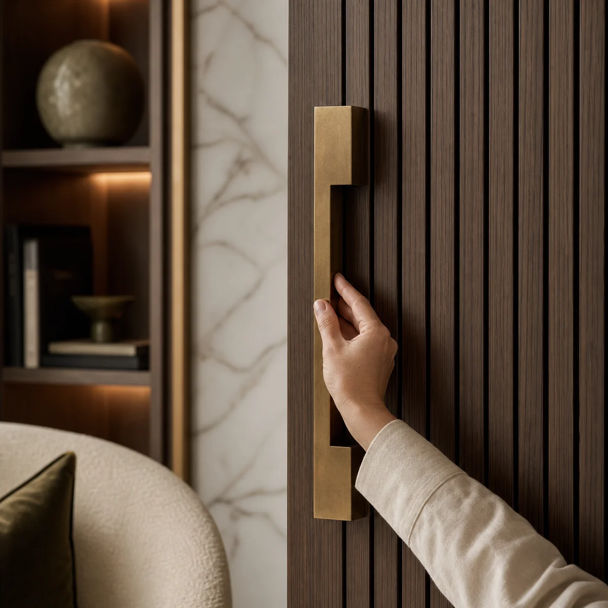
The pull a hand finds first. Brass, fluted walnut, a lit niche and stone: four of the five in one reach. Studio visualisation.
The ratio
Every calm room we have ever admired obeys roughly the same arithmetic. Seventy percent is the quiet field: walls, floor, the large furniture, all in tones that sit close together. Twenty percent is the support: wood, textiles, drapery, the mid-tones that give the field its depth. Ten percent is the voice, one deeper note spoken once and repeated where it matters. Olive, umber, ink. Then you stop.
- 70%
- The quiet field: walls, floor, large furniture
- 20%
- The support: wood, textiles, drapery
- 10%
- The voice: one deep note, spoken once
The failure is not too much colour. It is too little texture. A room that is seventy percent beige paint, twenty percent beige sofa and ten percent beige cushion is a hotel lobby. The same ratio in lime, oak and linen is a home.
Design the dark, not just the light
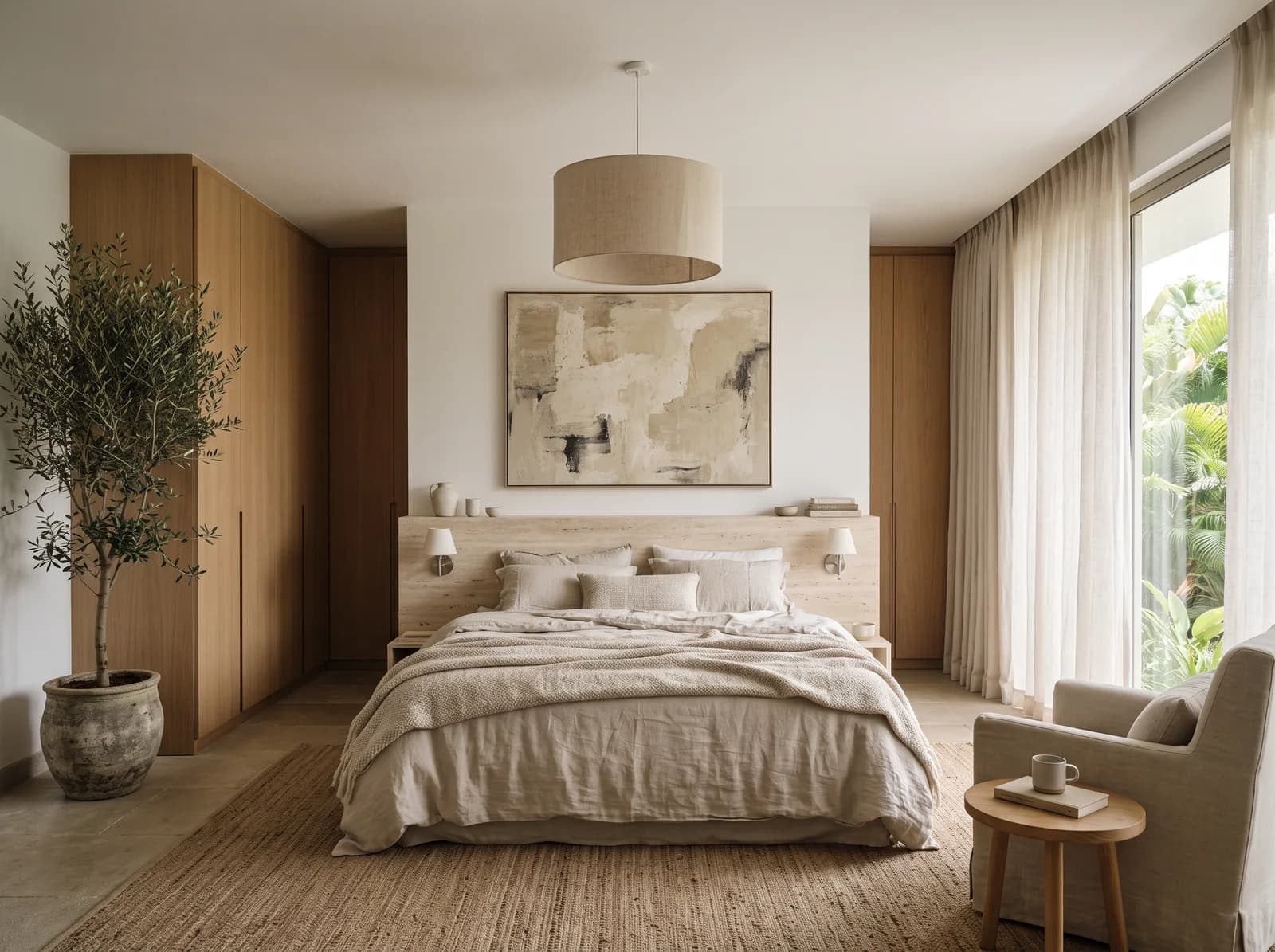
Rooms do not feel expensive because of what you see. They feel expensive because of what the light lets you see. A grid of downlights flattens every one of the materials above into the same beige. Three layers instead: something architectural that washes a wall, something for the work of living, and lamps at eye level for the evening. Then leave a corner in shadow. Luxury needs somewhere to hide.
One object per room
One sculptural thing is allowed to speak in each room. A pendant. A vessel. A chair with a curve. Not three. The restraint is the point, and it is also what makes the one object look like it cost more than it did.
“Neutral is a chord, not a note.”
The year-five test
Before any material goes on a board, we ask what it will look like in five years. Lime plaster softens. Oak deepens. Brass darkens. Linen relaxes. Every one of them ages in your favour. High-gloss laminate, mirror-polish stone and lacquer in a bright colour do not; they look their best on the day the photographer leaves. That test, more than any palette, is what quiet luxury actually means.
If you want to see the vocabulary in whole rooms, the Quiet European and Soft Minimalism designs in the boutique are built entirely from the materials above, each with its own board and an indicative band. And if you would rather see it in your own rooms, the first design is free: seven days from a floor plan to a photorealistic room and its material board.
Photographs on the Journal are the studio's own visualisations of rooms as designed, captioned as such. Figures are indicative Bengaluru bands, dated in each post, never a quotation.